Dive 2000
Website Redesign
Their aging website was not only an out-dated design it also wasn't responsive for mobile, tablet and desktop viewing.
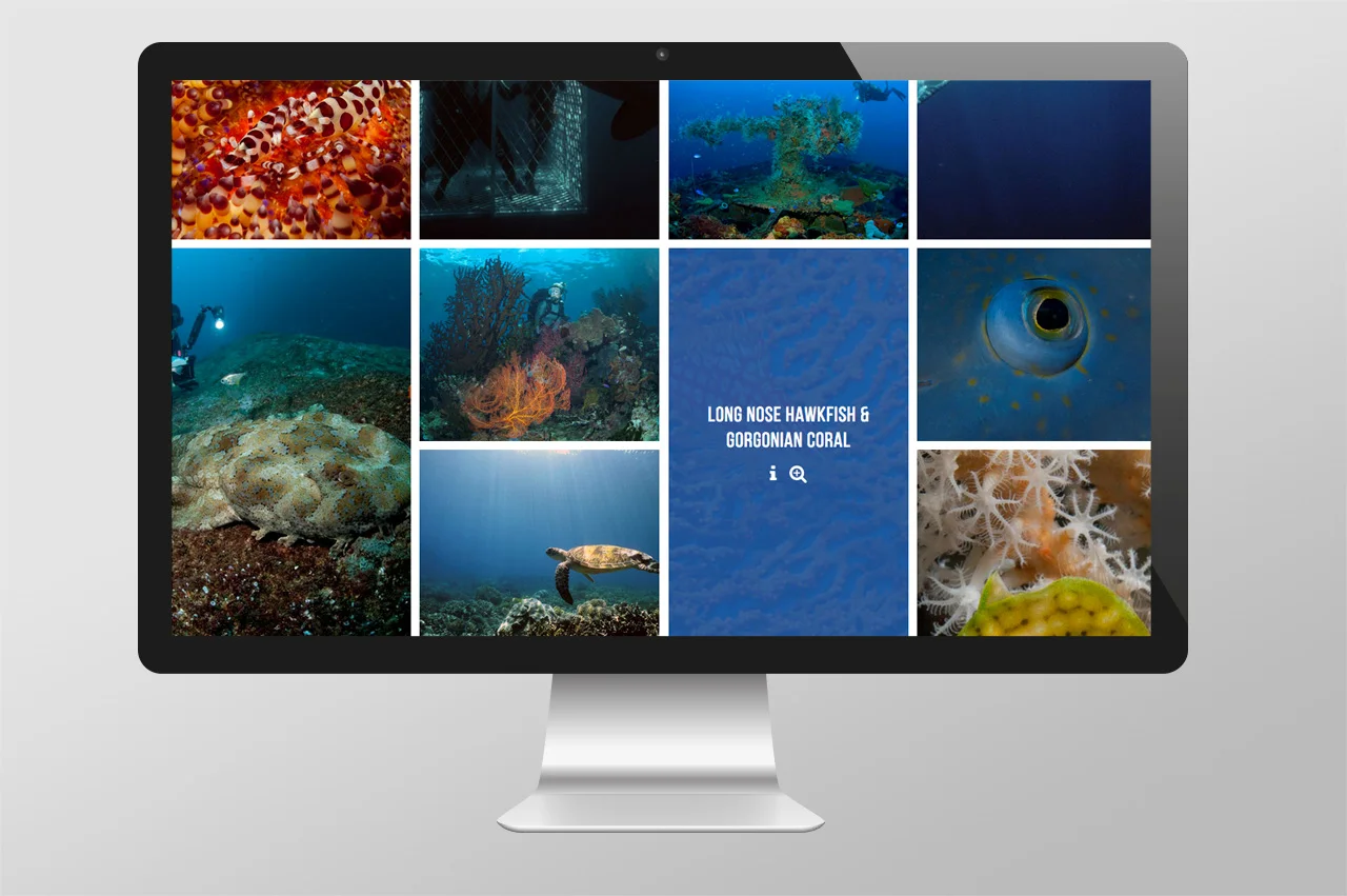
So we re-skinned their old website with a fresh new look and feel, using their own professional dive photography to make the website feel like you just want to jump into your screen and go diving.
Click here to visit website
What we did:
Art direction
Website Design


