Loud Noizez Branding Project
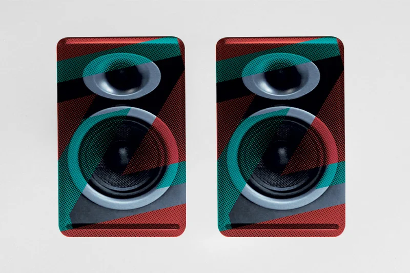


Loud Noizez Branding ProjectBranding for a Sound Design Firm. The idea for the logo, was use a big loud punchy font and then pulling apart the Z as if the sound was really loud. The introduction of 2 colours, red & blue is to visually show the the bass and treble. For other pieces half tones have been uses to add more "Noize"
info
/
1
2
3
4
·
·
·
·